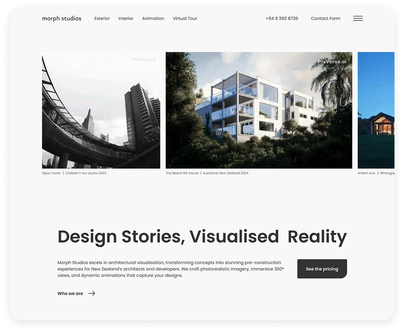
MorphStudios Website Redesign: Boosting Conversion Rate and Enhancing Presentation

Visit MorphStudios’ website for the full experience

Designer: Omid Mozayani
Product Manager & Developer: Mahdi Ashjaei
Project Type: Freelance
Tools: Figma, Elementor
Duration: Up to 6 months
Year: 2024-2025

About Morph

Auckland based Architectural Visualisation

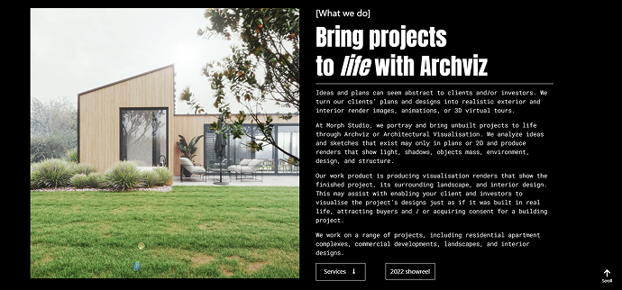
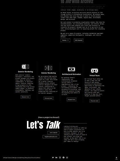
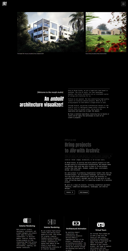
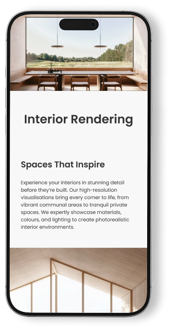
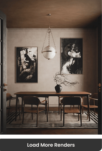
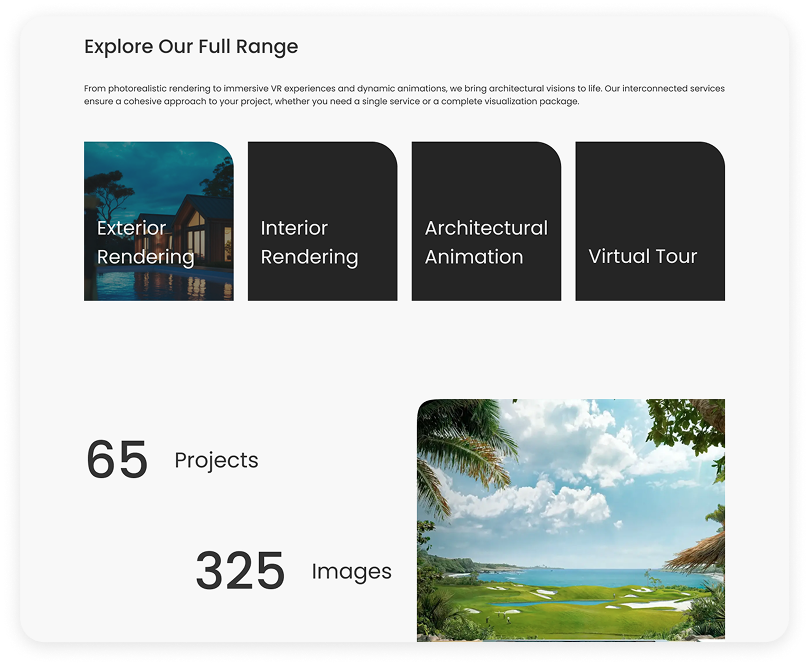
MorphStudios is an architectural visualization studio based in New Zealand, offering four main services: exterior rendering, interior rendering, VR, and animation. Morph brings its work to life by enriching each render with storytelling elements and extraordinary detail.

Why Redesign?

The Need for a New Website

Morph Studio's Redesign

Morph noticed that, compared to its competitors, their website looked outdated and overly simplified. In addition, the launch of new features created the need for a more effective platform to showcase and present their new services and renders.

Morph’s Aims and Goals

A Website that...

Morph aims to rank among the top four rendering studios in New Zealand, so their website needs to:

Potential Users

Our potential clients are primarily real estate companies, architectural agencies, and individual architects.

A Glimpse of the Old Website

What changed?

Logic Behind Potential Changes

Not Just a Solid Webpage

Designing a Storytelling Page for Showcasing Renders

In Services we used bold, large typography, high-quality renders, motion effects, and scrolls in different directions to create a presentation-like experience rather than an ordinary blog-style webpage.

With the main theme defined, it’s time to connect the flow.

Summarized Flow

Header

The Four Main Services Are Displayed Directly in the Header, While Other Pages Are Accessible via Burger Menu.

This helps users quickly understand the business category, plus these pages are also the most frequently visited.

A Footer with Purpose

Footer is Designed to Engage Users.

We tried to invite users based on their project status — whether they already have ongoing work or are looking to start from scratch.


With Ready to Go, they can upload their files directly, while in the clients form Morph contacts them to provide guidance and support through the process.

Old

New

Usability Test

We Conducted Usability Test to Evaluate How Well Our Design Performed.

We noticed that users had to scroll extensively to reach the main contact CTAs. To solve this, we made a small adjustment to the header, ensuring the contact option is always visible. It also can help to increase conversion rate.

Too Much Scrolling

Designed a “Load More” Button to Reduce Scrolling

Some users stopped scrolling after 3–4 times in the gallery section and moved to another page. As a result, they missed our contact information and other important messages placed further down. To address this, we now load only a few renders initially, allowing users to reveal more via a “Load More” button. This not only keeps users engaged but also improves page loading speed.

Location & Address

Many Users Expected to Find Our Location in The Home Page’s Footer.

Consistency in UI

Styles and Color Variables Were Limited to Achieve a More Consistent Design.

We limited the color palette to seven neutral tones.